Module 3 - Section 2
Design Thinking: A Crash Course
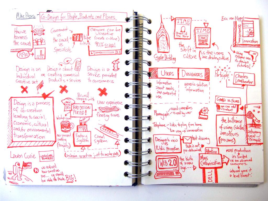
Let me introduce you to Jamie Thoms. He describes himself as a visual thinker - designer - doodler. I taught Jamie on his Master's course; it was always a pleasure to see how he had transformed a two-hour lecture into a compact, concise and engaging two page spread in his sketchbook. Below is his interpretation of my lecture on co-design.

Some people describe Jamie's technique as sketchnoting. It is a way of combining words and images and there is some evidence that it helps in embedding ideas in the memory more effectively. The more we get used to sketchnoting in our own study and work, then the better we will get at it, and the more effectively we can use it with others.
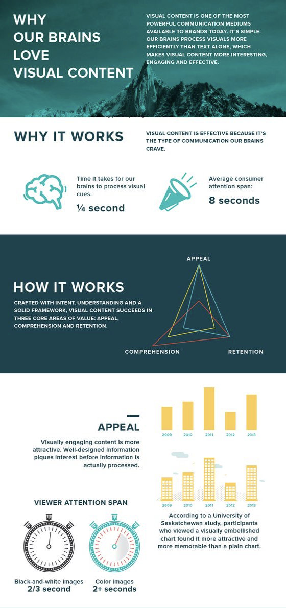
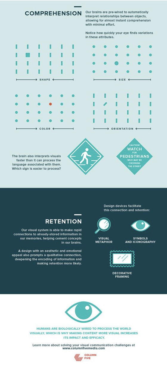
Designers combine visuals and text to capture their own understanding, and to communicate their ideas to others. Ours is a visual culture and as the infographic below explains, visual communication is often more immediate and clearer than textual.
Thinking visually is vital as a design tool (for designing any kind
of online learning resource) and for working in teams
collaboratively. That’s why this design thinking crash course is
here. It aims to do two key things:
Equip you with some basic but essential visual communication skills
that will enable you to design.
Understand the process, nature and value of design thinking. Let’s
get visual
Get some paper and some pens. You’re going to draw!
“But I can’t draw”.
Yes you can. Perhaps not like Leonardo da Vinci, but certainly good
enough to make visual sense to yourself and to others.
Visual thinking is a shorthand way of sharing ideas that enables a
wide range of people to engage quickly with your ideas. Drawing uses
a different part of our brain from verbal and written language,
which enables us to make connections we might not otherwise make. A
visual also shows ‘the big picture’ of an idea, plan or project, in
a way that a written document can’t. When we communicate visually we
edit and simplify ideas to communicate abstract concepts.
One of their most valuable aspects is their ‘sharability’ - we can
put an image in front of a group and they can immediately understand
it – which is impossible with a written report. You will create a
visual of your project to get a picture of what is happening now.
We don’t have to learn perspective drawing or go on a life drawing
class to give us the basic skills we need to communicate visually.
We just need to learn how to draw six basic shapes and know how to
combine them to tell a story. This is a simple method to get
started: copy the shapes in the top line – the star has to be five
pointed!
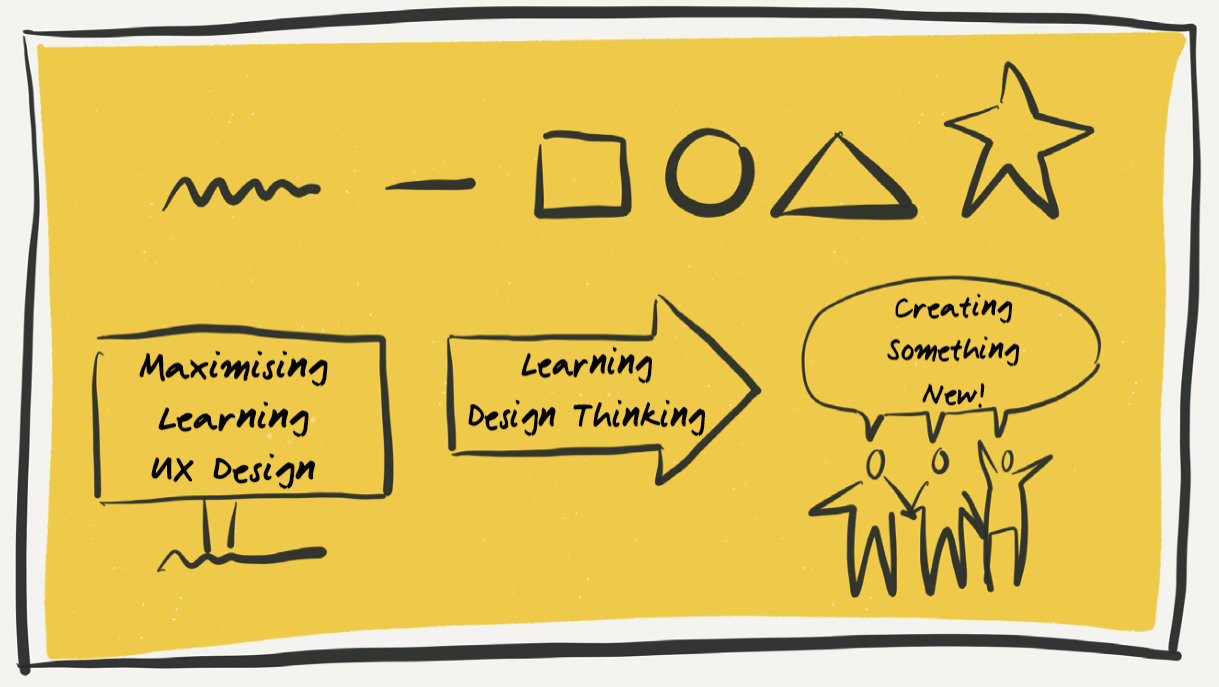
Put them together like the bottom row, creating a billboard to give
a sense of location and the arrow to indicate direction. Draw a
five- pointed star – but without the top point, to make a person,
then draw a speech bubble to show what people are saying/feeling.
You’re communicating visually.
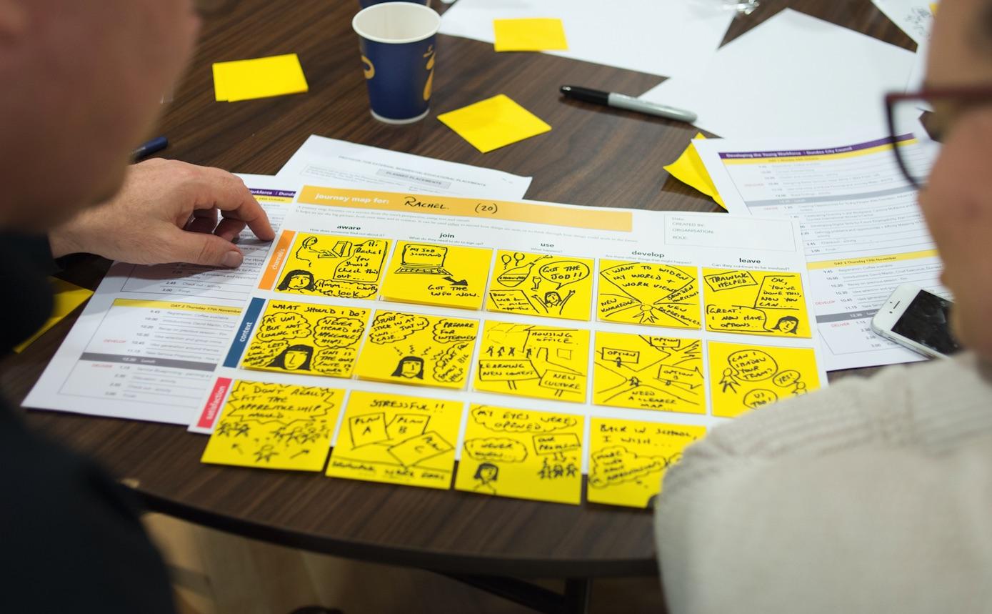
In the photo below we can see two employability professionals
redesigning the process whereby young people get into work. They are
using a technique called a journey map - which you will use later in
this module. But see how they are mapping the journey of the young
person visually. Visual communication helps to explain complexity,
to tell a story and to collaborate.
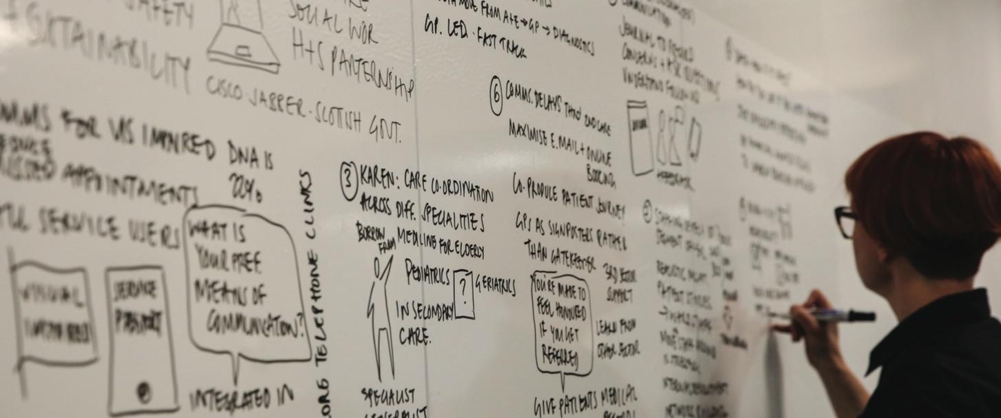
The photo below shows a workshop facilitator recording ideas developed by healthcare professionals and clinicians who were set on the task of redesigning health services in Tayside. Yes, there is text, but visuals are woven in to help tell the story to a large room full of people.
From now on in this module I want you to record your thoughts and reflections, not in conventional notes, but in sketchnotes. In the short video below Rebekah Olsen explains how to approach sketchnoting and shows some examples.

Activity 4.1
Blog
I now want you to equip yourself with some paper and a pen and sketchnote the next video presentation by Ole Qvist-Sørensen. A Sharpie pen would be ideal but is not essential. Ole Qvist-Sørensen will demonstrate to you Picasso's argument that we are all born artists, but the trick is to stay an artist as we grow up. We all have the ability to draw, and he will show you some basic forms that you need. As he says: “We are all visual thinkers and we can all draw”.
Activity 4.1
Blog
Next Rachel S. Smith, Director of Digital Facilitation Services for The Grove Consultants International in San Francisco moves us from demonstrating basic techniques to exploring some of the critical issues in visual note-taking. As you watch this video, we want you to produce a one page visual note of her talk.
The final video is a compelling example of how the dynamic visualisation of actual data can actually accelerate understanding and give new perspectives on existing problems. Hans Rosling sadly died in February 2017. As Professor of global health at Sweden's Karolinska Institute, his work focused on dispelling common myths about the so-called developing world, which (he points out) is no longer worlds away from the West. In fact, most of the Third World is on the same trajectory toward health and prosperity, and many countries are moving twice as fast as the west did. What sets Rosling apart was not just his apt observations of broad social and economic trends, but the way he presents them.
What Is Design Thinking?
Over recent years design has shifted from a product-orientated
family of disciplines to a strategically led set of methods and
tools that envision and facilitate change. It is seen most fully in
the corporate sector and has led to the emergence of design thinking
as a subject offered by the world’s more forward looking business
schools such as Stanford, Harvard and Saïd. In the past five years
in particular, design thinking has been applied to public services,
and is increasingly regarded as essential to their future.
According to Lucy Kimbell, associate lecturer in Design Thinking at
the Saïd Business School: "There are now several initiatives in the
UK and internationally in which design-based approaches are being
used to support innovation and improvement in public services and
tackling social problems." Introducing methods from design practice
– such as prototyping, user research, customer journey mapping and
codesign methods – have been shown to have a transformative impact
on public service design and delivery.
Let us consider design thinking from two perspectives. The first is
practitioner based, while the second is academic.
Design Thinking Opportunities for innovation in healthcare is the
transcript of a presentation by Rachel de Sain to the Connect,
Digital Health Summit held in Melbourne, Australia in March 2014.
Design Thinking: Exploring Values and Effects from an Innovation
Capability Perspective is by Lisa Carlgren, Maria Elmquist, and Ingo
Rauth, published in The Design Journal, Volume 17, Number 3,
September 2014, pp. 403-423(21) - you will need to be logged in to
the University library that subscribes to the Design journal to
access this paper.
I would now like you to look a little more critically at the concept
and consider where its core ideas come from, and the politics of
design thinking. The following is a brief talk by Mike Press,
Emeritus Professor of Design Policy at the University of Dundee:
Some (but not all) of the sources he mentions in the talk are available online if you wish to delve further:
-
https://ssir.org/articles/entry/design_thinking_for_social_innovation
-
http://www.core77.com/posts/14797/book-review-change-by- design-by-tim-brown-14797
-
http://www.core77.com/posts/16790/design-thinking-a-useful-myth-16790
Jon Kolko is a noted author, practitioner and educator in the field of interaction design and has a very clear view on the nature of design thinking:
His view is that design thinking is what designers do when they are
design ‘doing’ and brings together empathy, prototyping and abductive
reasoning. In addition to this he makes the point that design thinking
also requires craft knowledge, a knowledge of making, process, tools
and materials. And this applies as much to what you’re doing as to any
other craft practitioner. But your materials are not wood, clay or
metal but people, memory, attention, pixels, bits, software platforms,
etc.
While the materials, methods and tools may differ, all designers go
through a common process and this is what we turn our attention to
next.
The Double Diamond
So, you have some contextual understanding of design thinking, and
know that it is about applying the thinking and methods of design to a
broad range of problem areas, such as healthcare. It is also vital in
ensuring that online communications and interactions are designed to
give an engaging and focused experience for the user.
The design thinking process has been described by the UK Design
Council as a double diamond of four phases: discover, define, develop
and deliver.

Activity 5.1
Blog
This block of learning has covered a fair bit of ground, which
we are going to try to pull together. You are asked to produce
an 10-15 slide slide-deck entitled: 'the value of design
thinking to my field.' We want you to make the slides visual and
clear. Use sketchnotes and strong photos or graphics. This
activity will not only focus your ideas and thinking, but make
you more aware of fundamental principles of effective visual
communication. With each slide provide a written narrative - or
a voice over.
Based on the information in the two videos (and some of the
additional links), write a short summary responding to the
following questions:
- What in your view are the key characteristics of design thinking?
- What value would design thinking play in your workplace or professional context and to you in your personal professional development (perhaps find evidence of how design thinking has been applied within your community of practice)?
- How could visual communication support you in your professional work?
You should post your response to this activity on your blog.
Activity 5.2
Blog
Before you knuckle down and hammer bullet points into
PowerPoints can we hold fire for a moment and think about the
basic principles of visual communication in a slide deck
To make a slide deck, I recommend you take a look at this advice
- http://blog.podio.com/2014/05/27/10-presentation-tips/
- https://designschool.canva.com/blog/presentation-design-101/
- http://blog.ted.com/10-tips-for-better-slide-decks/
The key lessons from all of this advice boil down to
consistency, simplicity, minimal text, strong visuals - along
with some more prosaic advice like never use clip art or whacky
fonts. These principles also hold true for UX design.
When you have prepared this slide deck, then upload as a .key
.ppt or .mov file to your blog.